Launching a digital agency
in Dubai

The Context
I moved to Dubai for a Creative Director role to assist a team in launching their digital agency.
Working with the two founders in a new environment with a clear goal and their strong motivation to build something great was simply energizing. I eventually stayed there for 2 years helping them grow their business working with industries from Real Estate, FMCG to Healthcare and more.
Building the brand
The three founding partners names all started with an A, hence the name triple AAA, that also stands for a rating of exceptional quality.
The main concept for the brand was to mix technology, marketing in a fresh yet approachable way. The other factor was to make a statement and stand out from a crowded digital market in Dubai.
After experimenting with shapes and letterings, we settles for a logo what could symbolise speed, truthfulness, efficiency and personality. The inspiration came from airline-inspired logos.
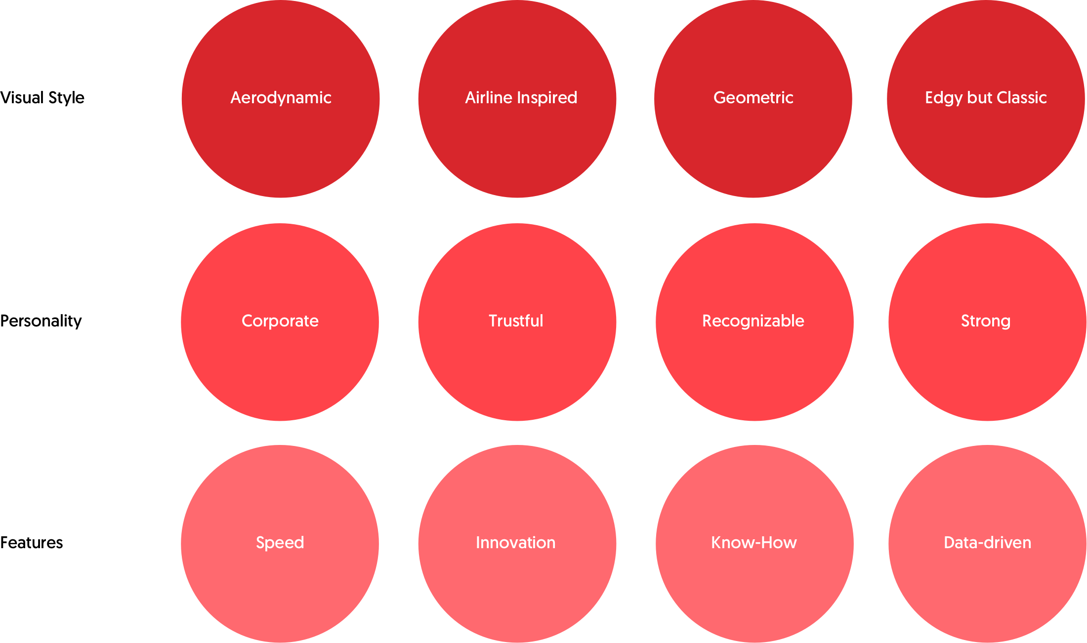
The logo design process…

The final logo


The Business Cards
Everyone knows a good first impression is fundamental in business situations. This was especially true for a startup with a strong sales-oriented approach that needed to stand out from the crowd. From business meetings to trade shows, the AAAGENCY name cards had to be different to stand out.
I designed AAAGENCY’s business card to look corporate but still able to stick out in a pile of name cards. With a glossy front in full red background with the logo in white and a white back with a big A shape that allows for cleanliness and legibility. The big factor was the hand cut slice from the A shape that gives a different perspective for the overall brand.
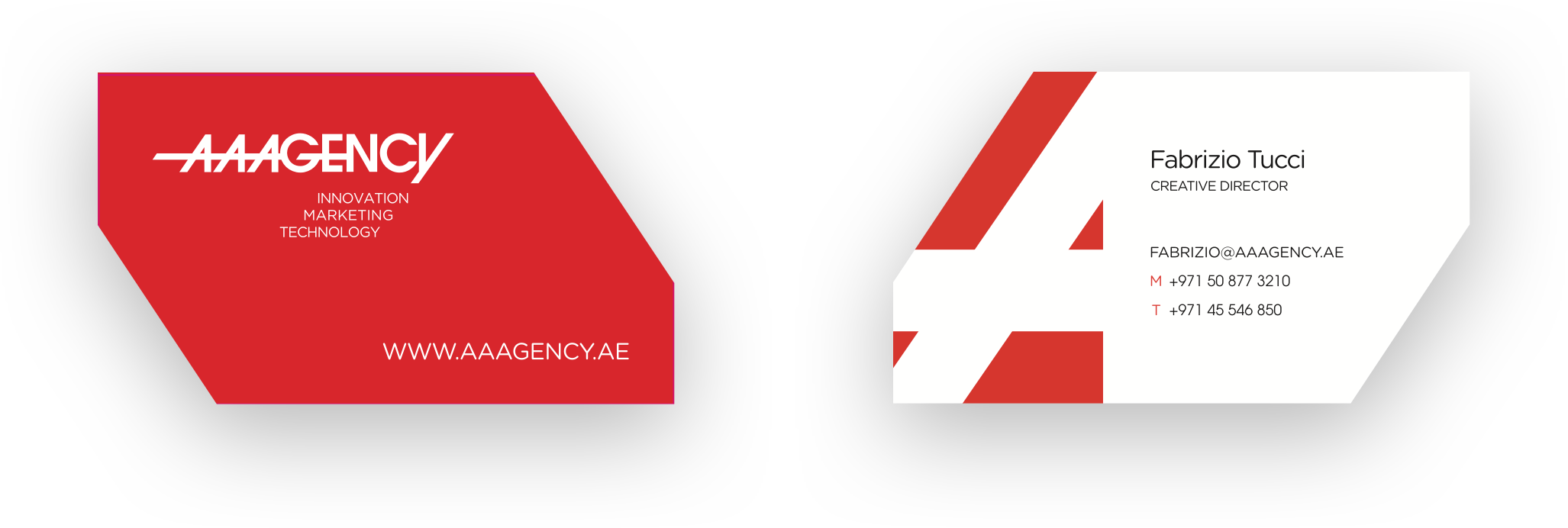
The response
The strong red and peculiar cut had a great impact in meetings. The business cards brought great results and feedbacks were positive about the cards.
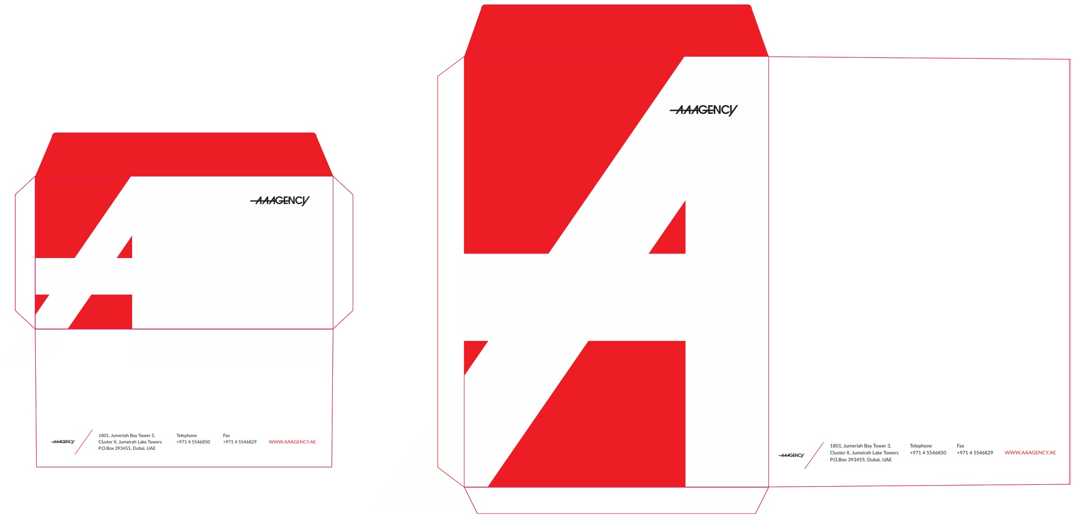
The "Red Envelopes"
The envelopments for documents was a design requested by the CEO. The bold corporated red, the big A shape and the adoption of a thick paper that felt amazing to touch and feel, made these envelopes another asset in the AAAGENCY branding.
Pitch deck
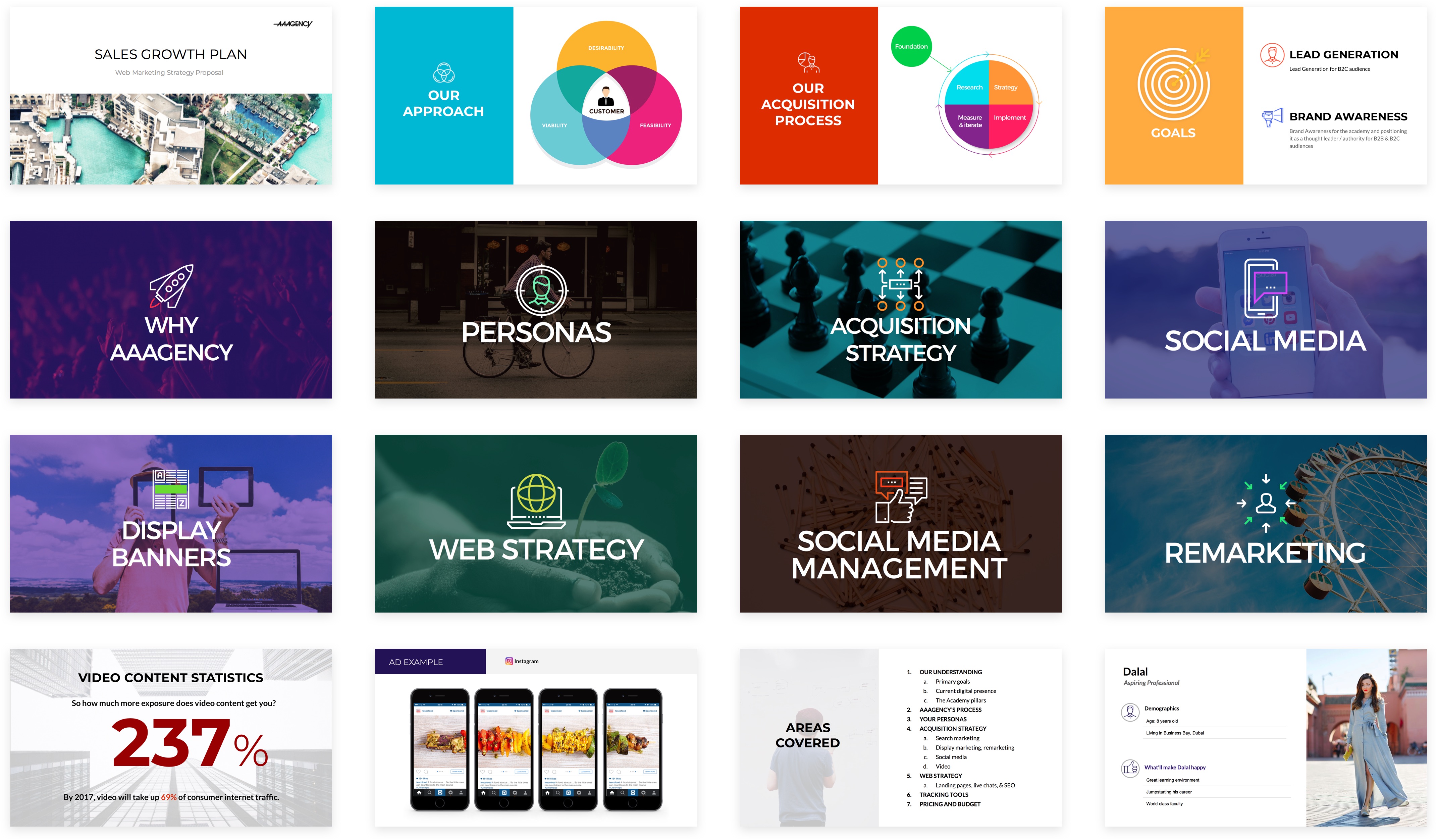
One of the design components in AAAGENCY that I was working on was pitch decks. Pitching different companies in different market requires great flexibility and an appealing visual style and language.
Creating an effective pitch deck template that could cover all the services offered and adapted to any situation. The overall look and feel is modern, bright and geometric with legible typography.
